Fonts that will add that stunning look to your design
Montserrat
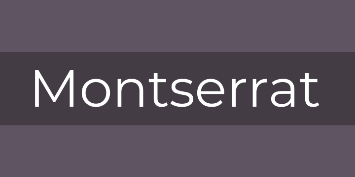
The old posters and signs in the traditional Montserrat neighborhood of Buenos Aires inspired Julieta Ulanovsky to design this typeface and rescue the beauty of urban typography that emerged in the first half of the twentieth century. As urban development changes that place, it will never return to its original form and loses forever the designs that are so special and unique. The letters that inspired this project have work, dedication, care, color, contrast, light and life, day and night! These are the types that make the city look so beautiful. The Montserrat Project began with the idea to rescue what is in Montserrat and set it free under a libre license, the SIL Open Font License.
This is the normal family, and it has two sister families so far, Alternates and Subrayada. Many of the letterforms are special in the Alternates family, while ‘Subrayada’ means ‘Underlined’ in Spanish and celebrates a special style of underline that is integrated into the letterforms found in the Montserrat neighborhood.
Source Sans
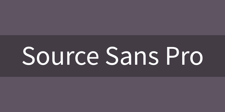
Source Sans Pro was designed by Paul D. Hunt as Adobe’s first open source typeface family, conceived primarily as a typeface for user interfaces. Source Sans Pro draws inspiration from the clarity and legibility of twentieth-century American gothic typeface designs. Distilling the best archetypical qualities of these models, Paul followed a rational design approach by simplifying glyph shapes by paring them to their essential form. However, in order to more easily differentiate similar letter shapes (such as uppercase I and lowercase L), some additional details have been added. Besides providing such explicitly clarity in short text strings, another fundamental design consideration was to create a typeface that reads well in extended settings. This can be seen in the general proportions: Source Sans Pro has been designed with a more generous width than many other comparable gothics, and its shorter majuscule letters, combined with minuscule letters with longer extenders, create a more pleasant reading texture in longer text passages.
Sofia Pro Font
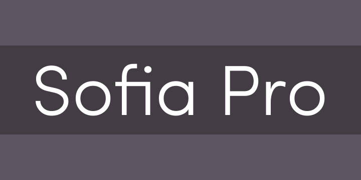
The goal of this new type was to create a sans serif font which give an impression of both modernism, harmony and roundness. These nuances give Sofia a harmonious and sensible appearance for both texts and headlines.
This typeface is a complete redesign of Sofia initially designed in 2008. this typeface supports a wide range of languages with more than 500 glyphs. This new version has also more OpenType features like case sensitive forms, ,small caps, contextual alternatives, stylistic alternates, fractions, proportional and tabular figures…
Museo
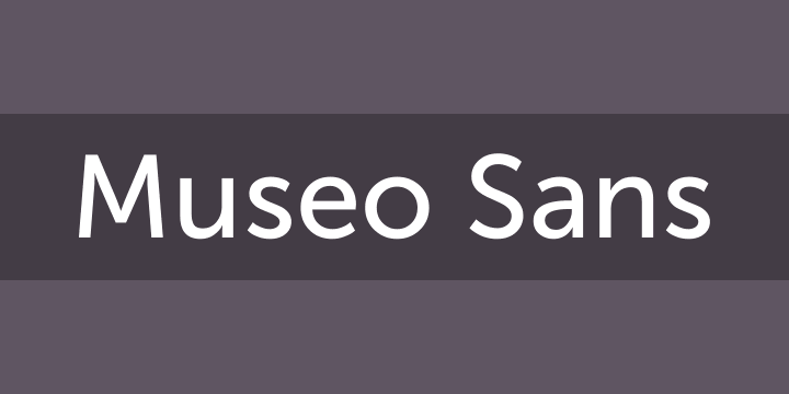
It is a sturdy, low contrast, geometric, highly legible sans serif typeface very well suited for any display and text use.
This OpenType font family offers also support for CE languages and even Esperanto. Besides ligatures, automatic fractions, proportional/tabular lining and old-style figures, numerators, denominators, superiors and inferiors MUSEO also has a ‘case’ feature for case sensitive forms
This OpenType font family offers also support for CE languages and even Esperanto. Besides ligatures, automatic fractions, proportional/tabular lining and old-style figures, numerators, denominators, superiors and inferiors MUSEO also has a ‘case’ feature for case sensitive forms
Playfair Display Font
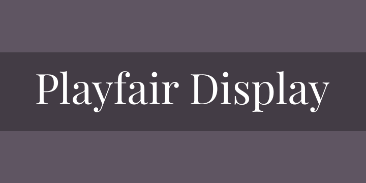
Playfair is a transitional design. From the time of enlightenment in the late 18th century, the broad nib quills were replaced by pointed steel pens. This influenced typographical letterforms to become increasingly detached from the written ones. Developments in printing technology, ink, and paper making, made it possible to print letterforms of high contrast and delicate hairlines.
This design lends itself to this period, and while it is not a revival of any particular design, it takes influence from the designs of printer and typeface designer John Baskerville, the punchcutter William Martin’s typeface for the ‘Boydell Shakspeare’ (sic) edition, and from the ‘Scotch Roman’ designs that followed thereafter.
As the name indicates, Playfair Display is well suited for titling and headlines. It has an extra large x-height and short descenders. It can be set with no leading if space is tight, for instance in news headlines, or for stylistic effect in titles. Capitals are extra short, and only very slightly heavier than the lowercase characters. This helps achieve a more even typographical colour when typesetting proper nouns and initialisms. Languages, like German, where nouns are capitalized, particularly benefit from this lower contrast between lower and upper case glyphs. In German, with its many capitalised words, and in other European languages that use many diacritical characters, it is advised to use more leading.
You can download all these fonts in : here


No comments:
Post a Comment